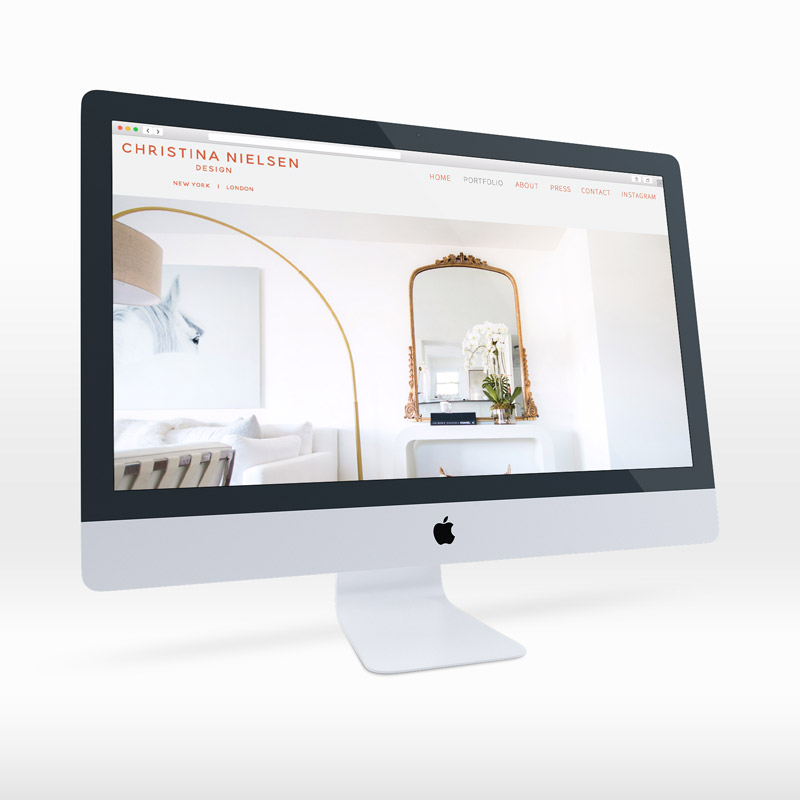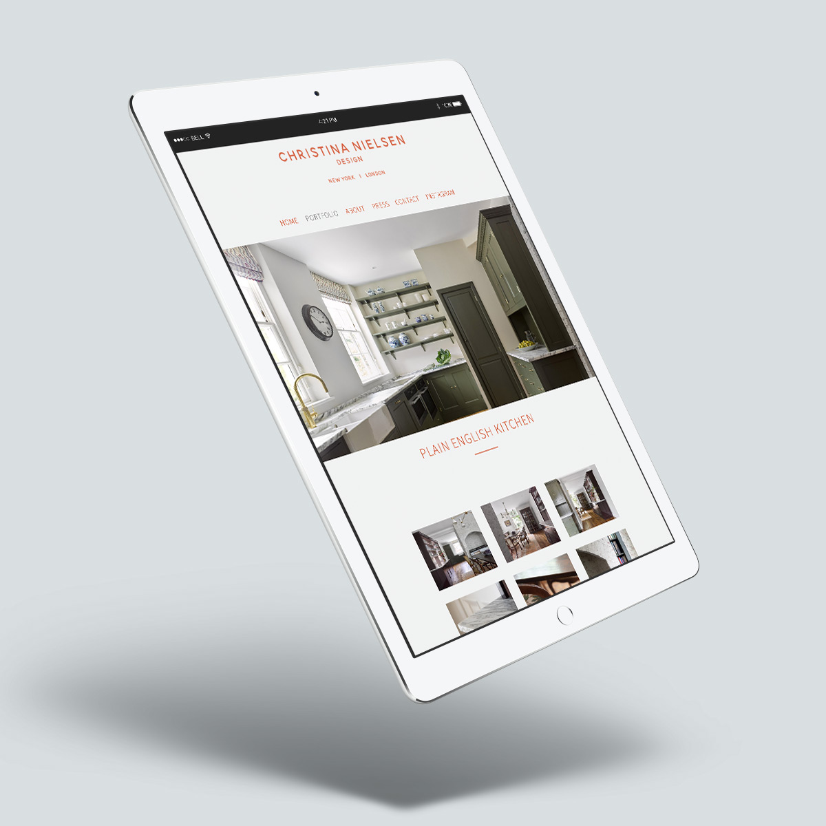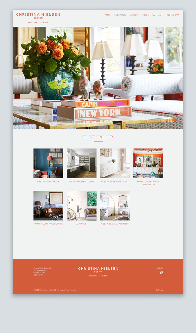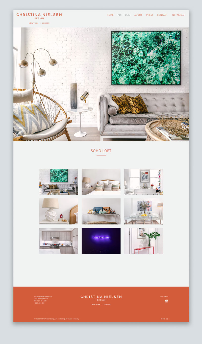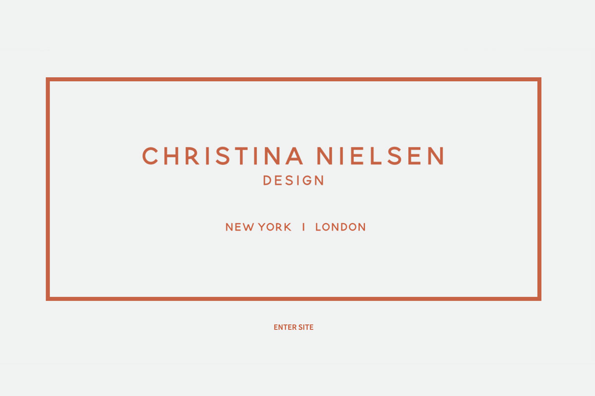
Christina Nielsen, an up-and-coming interior designer, needed a website to highlight her portfolio. I designed and programmed a minimal and sophisticated site to offset the photography of her spaces. I finetuned her logo and did a thorough exploration of font and color combinations.
We ultimately decided on an orange reminiscent of the timeless Hermès orange accentuated by a limited palette of white and light gray. I carried the new design through to a set of custom Mailchimp templates and got her started with a targeted and segmented mailing list.
- Web Design
- Programming
- Mailchimp
